
Why do you like colours?
Macca's and Pantone are doing the same thing to us and we don't even know

Hey! Did you pay much more attention to your coffee cup this week?

Style over substance
A couple of years ago I announced to a friend it was going to be the year of style over substance: no thoughts, only aesthetics. Only cute, no smarts.
Two years later, you’re exhausted from the mental load of a pandemic that won’t end, triple-vaccinated but still over-thinking every outing, and wondering if you have to cancel anything in the next fortnight if you get The Big Sick.
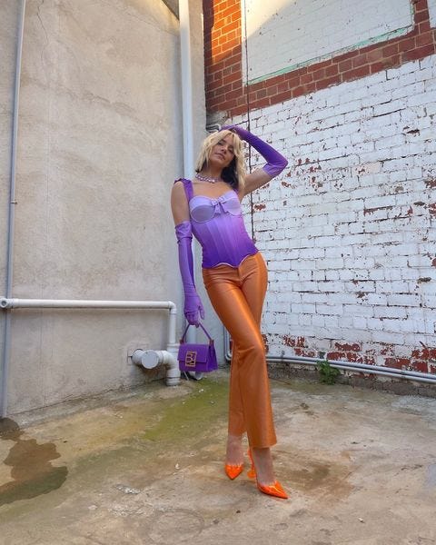
But, there’s one thing that you can do to directly impact your environment: dopamine dressing.
Using colours for dopamine
Rather than thinking about your clothes in if-it-fits kind of way, dopamine dressing is a lens for dressing ourselves that prioritises fun things. This in turn will raise your excitement and delight for clothes.
Why not? It’s one of the few things we can control, and it’s something that we can all directly alter. It’s great!
The idea behind dopamine dressing is that you might be able to alter your mood if you dress in bright colours.
Is that real or is it a fad?
Using colour to alter your mood isn’t really a new thing at all. McDonald’s for example, use red because:
that colour stimulates you
gets your heart rate up
therefore gets you thinking about refueling, and eating a Happy Meal
The colour yellow is also most commonly associated with sunshine and happiness. And if you’re not happy when you’re looking at fresh Maccas fries, when are you truly happy?

Red in particular is also associated with love, horniness, and dominance. So if you’re feeling horngry looking at this logo, you’re probably not alone.
Let’s have a think about Pantone’s COTY (Colour Of The Year)
Incredible how Pantone managed to make literally colours into some brand you can profit off. I’m both impressed and annoyed by how easy it is to make money. But I digress.
Everyone! Talks! About! Pantone! COTY!
Each year, there’s this huge swell of press about how Pantone has selected ONE1 SINGLE COLOUR that will set the pantone for the rest of the year.
Last year, it was grey and yellow because we were all sad but perhaps one day we will be happy again. This year, it’s Very Peri, which is basically a very nice purple.
Or, as Pantone describes it:
New Pantone Color Whose Courageous Presence Encourages Personal Inventiveness And Creativity.
I also googled what the meaning of purple was and it told me this:

Not to say that the people at Pantone simple googled “meaning of purple” and then invented a new purple, and named it colour of the year. I mean, apparently the people in that place can see colours we can’t, as if they were little birds who can see four colours instead of three.
But this colour represents two things:
Creativity, weirdness, and light-heartedness: in a meta way, it talks to our need to start dressing ourselves more brightly, more creatively, in order to combat a continuously depressing
panoramicpandemic.Sadness and frustration: the blue hue of purple acknowledges that that yeah, there’s death and mourning. And perhaps there’s a war coming. But we’ll talk about that another time.
Take control of your own colours
In both Macca’s and Pantone cases, we are being told which colours to have a response to, and we frame our experiences based on those colours.
In both cases, they might be correctly predicting our responses, but that doesn’t mean that you have to put red in your kitchen, or find a purple shirt to wear and hope for the best.
The point is, you can choose2 what you wear at the start of each day. You don’t have to match, just pick the colours you like.
So choose style over substance, and dress for your own dopamine
Handwriting, walking, cooking, and dressing yourself all have something in common: everyone has a unique style to doing it, even if they don’t intend for it to happen. So I’m not out here saying you should start dressing like this:
You can choose to dress for dopamine, as Pinterest told us we should, or you can simply choose to surround yourself with the colours you like.
And if you really don’t want any clashing colours, download a colour wheel app, pick a colour, and go from there. It’s lifechanging, understanding what triadic colour combinations are.
Much love,
Sam
Next week, maybe we’ll talk about some dopamine dressing tactics that aren’t just “bright colours and loud patterns”.
Last year they did 2 colours
I DON’T want to get into determinism today okay?? That’s too much thinking and not enough being cute and this piece is about being cute ONLY.